
Show/Hide Columns in Elementor (Easy Guide)
Crafting engaging and responsive layouts that adapt seamlessly to different screen sizes is crucial for modern web design. Elementor, a popular drag-and-drop page builder, empowers you to achieve this effectively with its built-in column visibility controls. This article guides you through the simple process of showing or hiding columns on desktop, tablet, and mobile devices within Elementor.
Prerequisites:
An active Elementor installation (free or Pro version)
A basic understanding of Elementor’s interface and sections/columns structure
Steps:
- Access the Column Settings:
- In your Elementor editor, locate the section containing the column you want to adjust.
- Click on the column to select it.
- In the left-hand panel, navigate to the Advanced tab.

2. Enable Responsive Mode:
- Under the Advanced tab, locate the Responsive section.
- Click the eye icon next to Responsive to activate it.
- This displays responsive visibility controls for different devices.
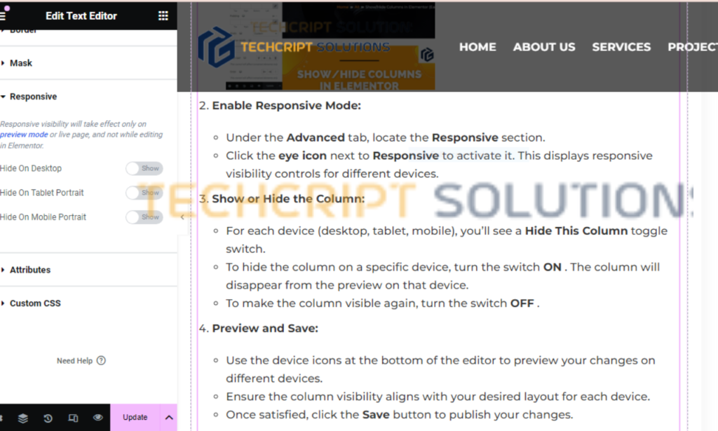
3. Show or Hide the Column:
- For each device (desktop, tablet, mobile), you’ll see a Hide This Column toggle switch.
- To hide the column on a specific device, turn the switch ON.
- The column will disappear from the preview on that device.
- To make the column visible again, turn the switch OFF .
4. Preview and Save:
- Use the device icons at the bottom of the editor to preview your changes on different devices.
- Ensure the column visibility aligns with your desired layout for each device.
- Once satisfied, click the Save button to publish your changes.
5. Tips and Best Practices:
- Experiment with different column layouts on various devices to optimize user experience.
- Consider hiding non-essential content on smaller screens to prevent clutter and enhance readability.
- If you need more granular control, Elementor Pro offers additional responsive options, such as adjusting column width and margin per device.
- For complex layouts, utilize Elementor’s Inner Sections to create nested responsive structures.
- Thoroughly test your responsive design on actual devices or browser emulators to ensure optimal appearance across platforms.
By following these steps and adopting the suggested tips, you can effectively control column visibility in Elementor, creating responsive layouts that deliver a positive user experience on all devices.