How To Display and/or Hide Menu Items On Desktop Or Mobile Devices
Use different menu items for different device sizes.
Sometimes, you may want different menu items to show up on different devices. Here’s how to do that by showing or hiding menu items based on the device’s screen size.
First, add some CSS code to your theme. Go to Theme Options > Custom CSS. It’s best to use a child theme or a CSS plugin.
Below is the code snippet. Paste it into Theme Options > Custom CSS or your CSS plugin.
					/* Hide element on Desktop */
@media only screen and (min-width: 981px) {
    .hide-on-desktop {
        display: none !important;
    }
}

/* Hide element on Tablet/Phone */
@media only screen and (max-width: 980px) {
    .hide-on-mobile-tablet {
        display: none !important;
    }
}
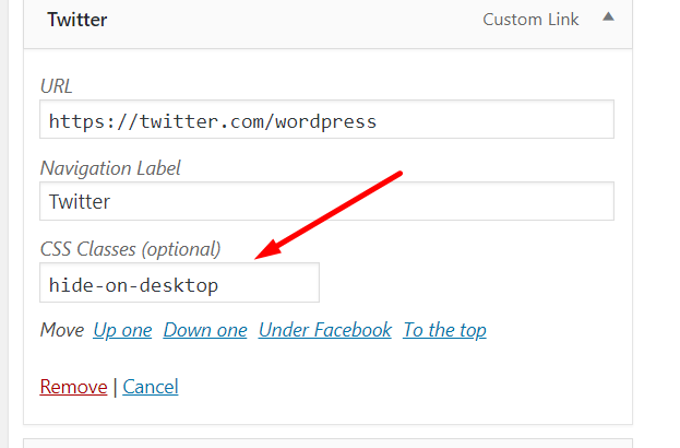
After adding the CSS, simply use the class below on the menu item you want to hide on tablets and phones (screens smaller than 980px), or adjust it as needed:
hide-on-mobile-tablet
And use this CSS class to hide the menu items you don’t want to show on desktops:
hide-on-desktop
Add it here:
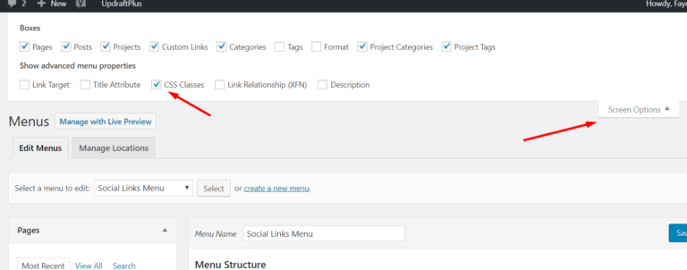
NOTE: If you can’t see the “CSS Classes” field in the Appearance > Menus screen, click on Screen Options in the top-right corner and check the box to make it visible.